Branding and Web DesignStone fertility
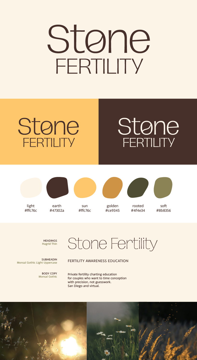
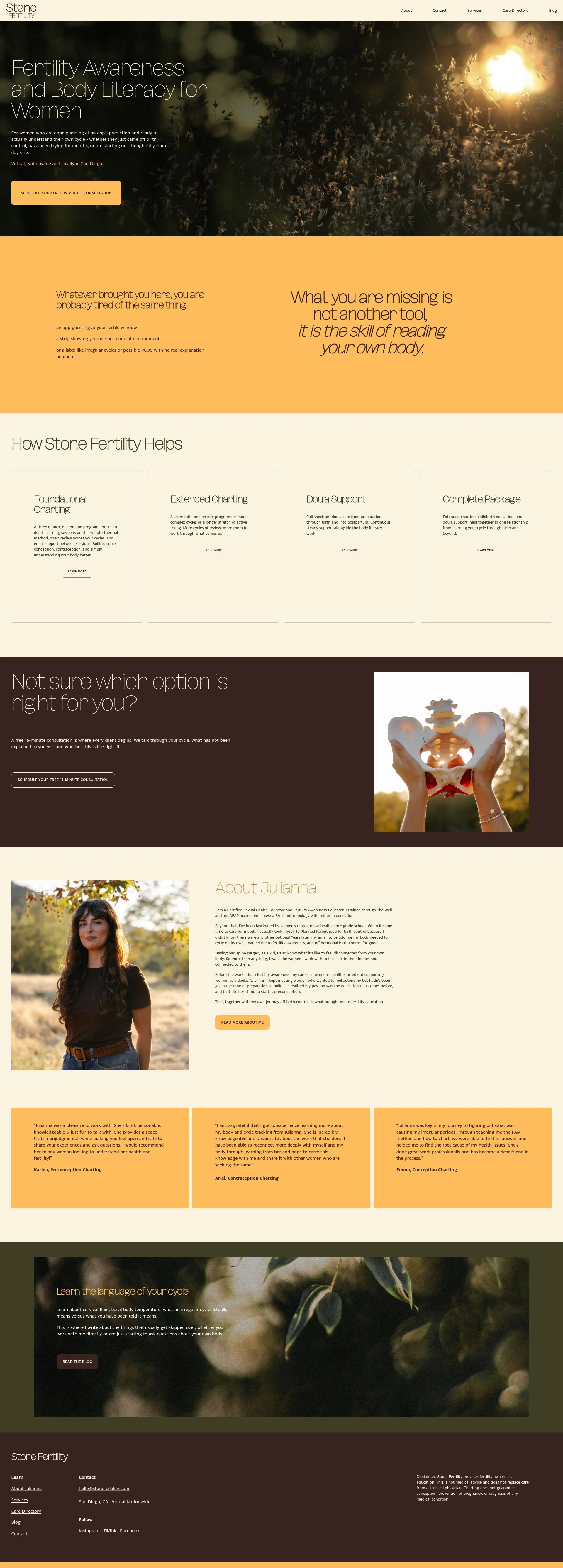
The goal was a warm, friendly, cozy and natural feeling brand and website. We did a slight refresh of the logo, keeping the “charting egg” motif in a new, simplified way. The ask was to lean into yellow and brown, so my inspiration was the earth and sun. I picked colors that pulled from other spots in nature, and found imagery to lean into those colors and bring them in with textures to the website.
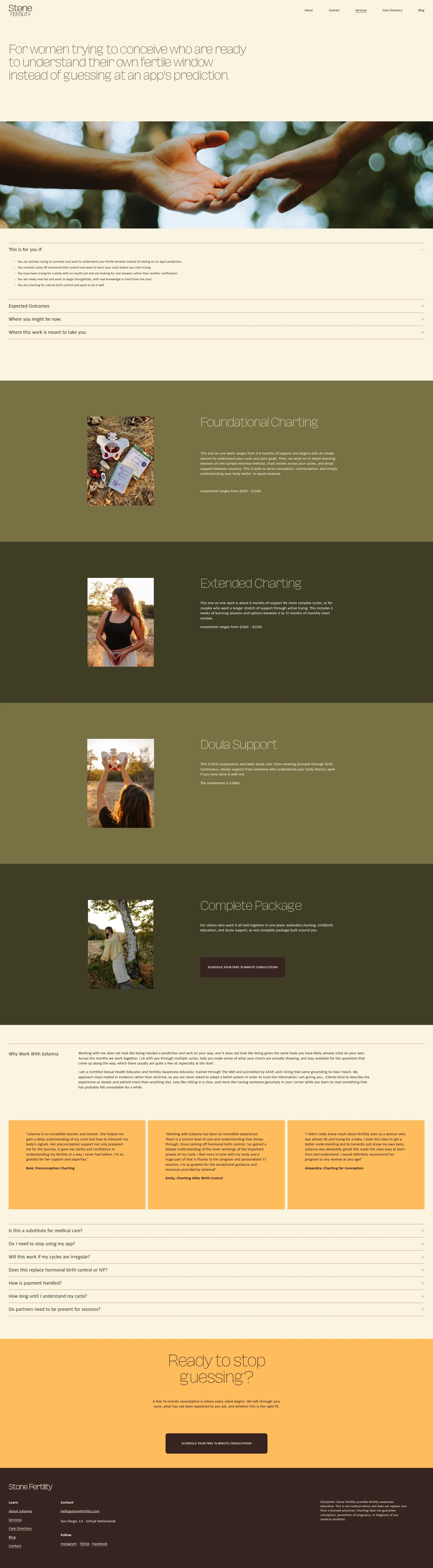
The final result is a clean, professional, warm brand and website.